


PENFIELD
A BRIGHT FUTURE FOR EVERYONE
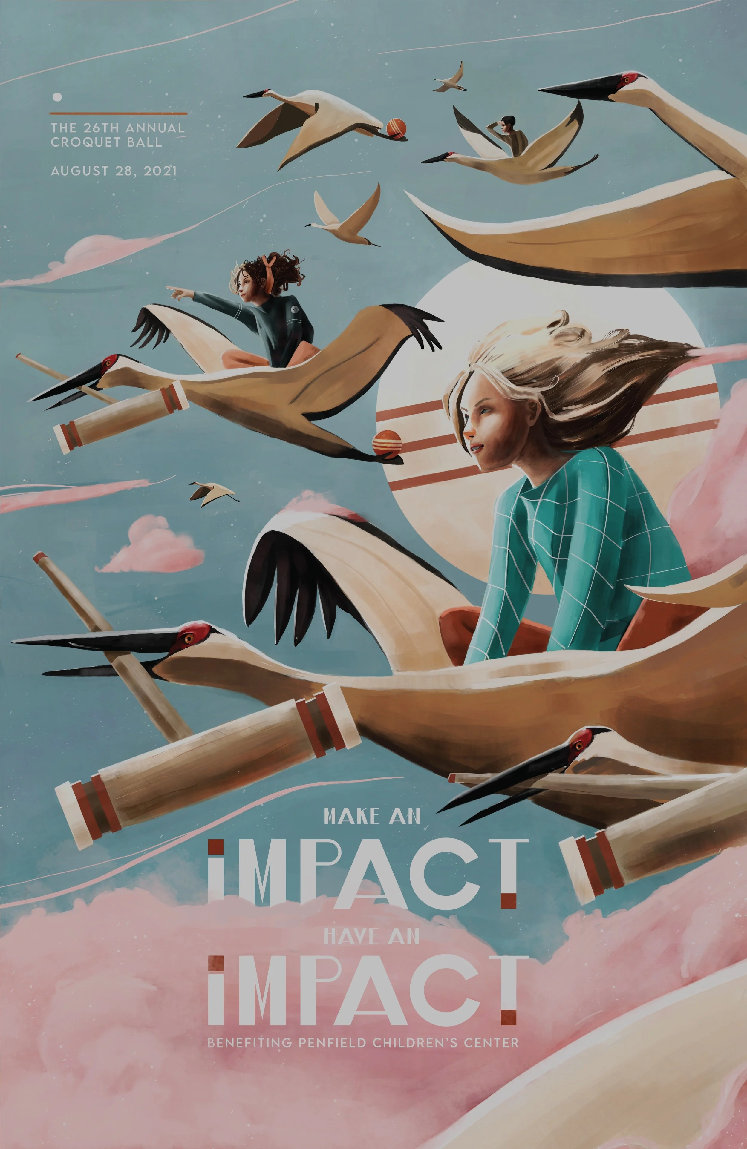
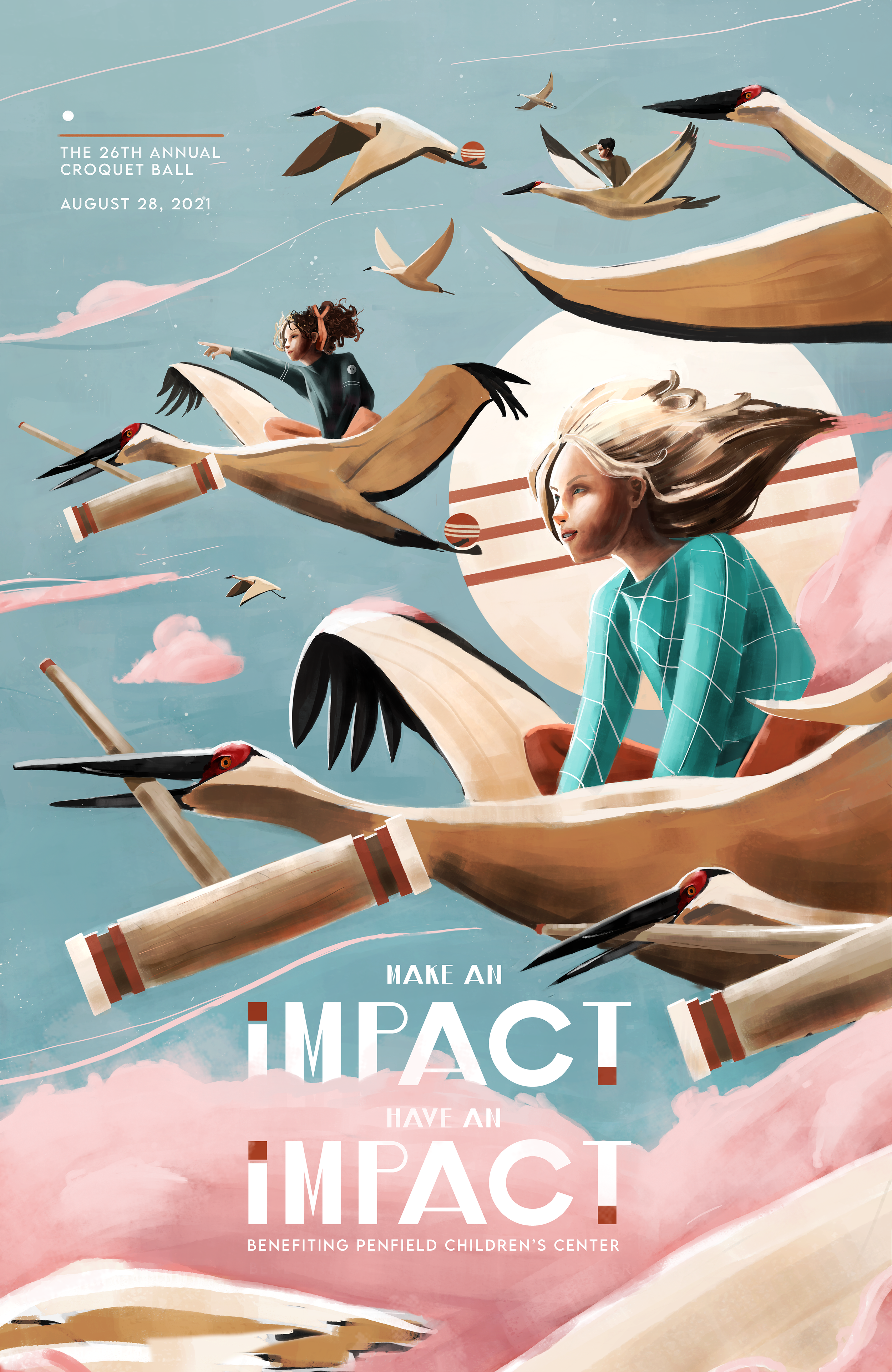
Each year, Penfield Children’s Center hosts a croquet ball in which posters are auctioned off to raise funds. This illustration shows how Penfield helps children live life to the fullest and reach for the sky with their aspirations. These posters were illustrated with the sponsorship of advertising agency Cramer-Krasselt (CK).
For this project, I illustrated how funds raised with the croquet ball helps children live a full live and reach for the sky with their dreams and aspirations.
The poster was awarded a Best in Show award by the United Ad Agency, and was awarded first place by Penfield.
SERVICES:
Illustration. Poster Design.
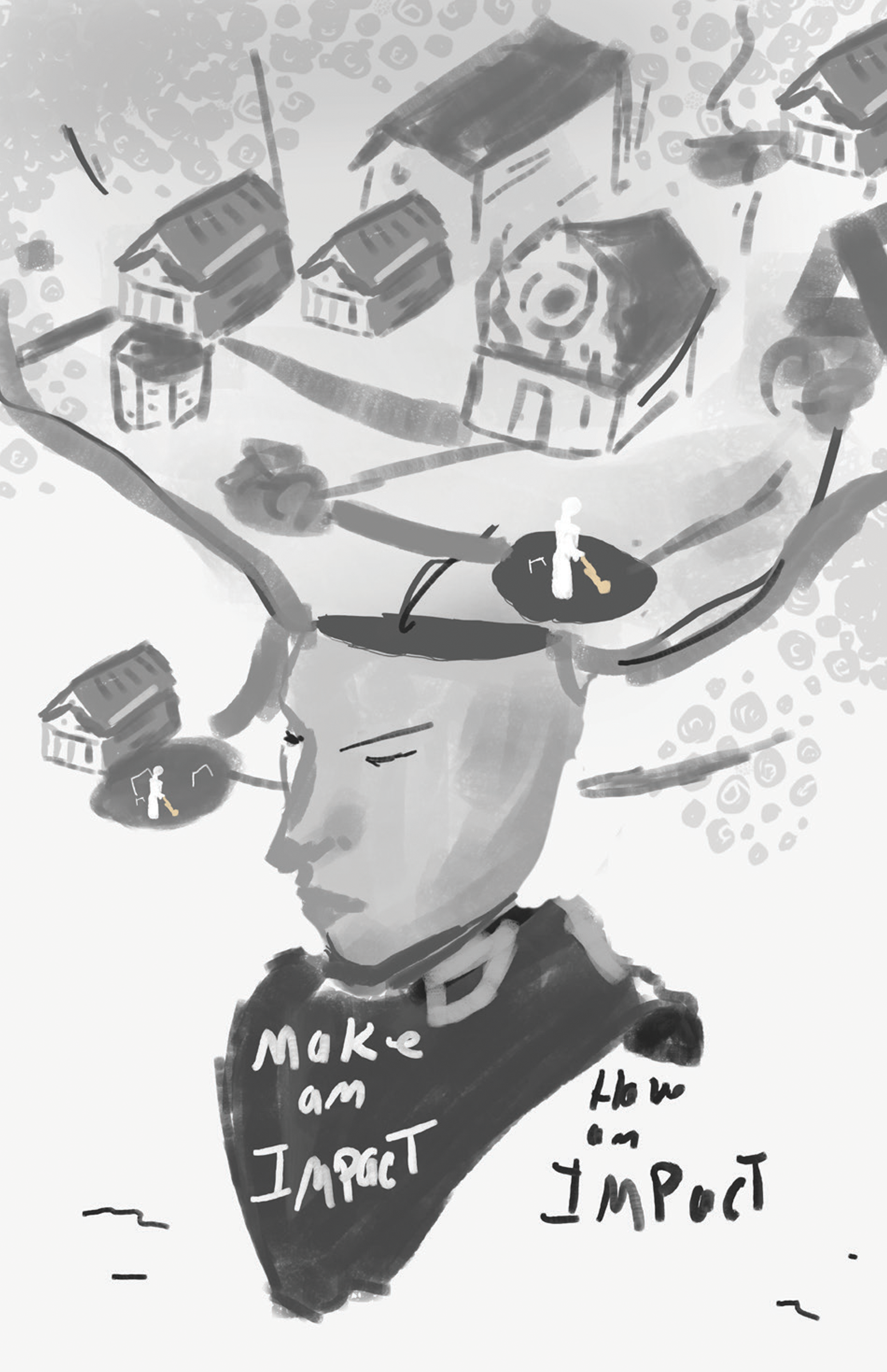
ROUGH SKETCHES
During the rough sketch phase, I explored design solutions with a few parameters in mind. First, that the design be whimsical, to be fun for the children to view. Secondly, to be refined and elegant, to be worthy of a place in any donors home. Croquet needed to be the main focus, but I wanted to abstract it just enough to be intriguing.
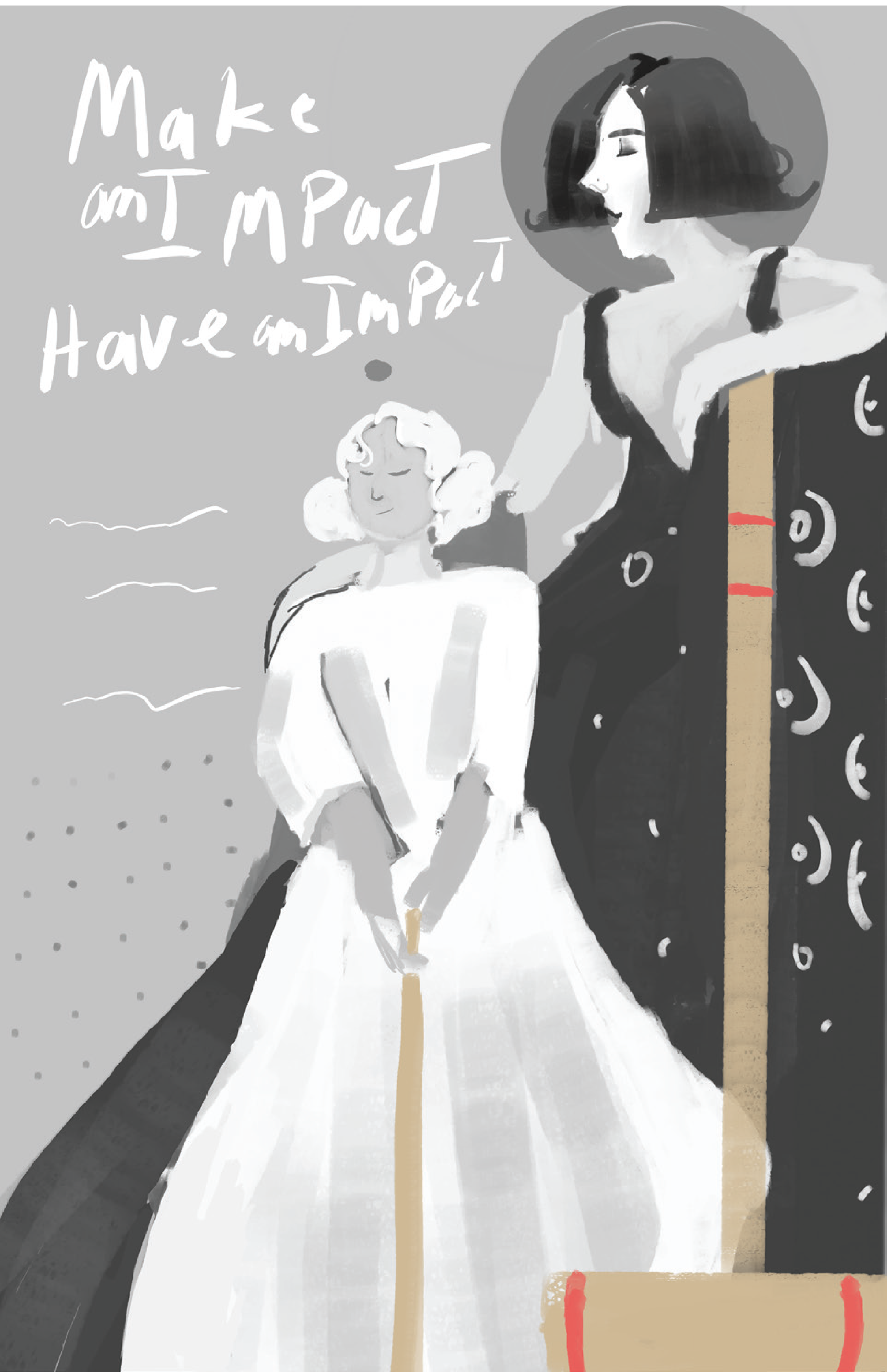
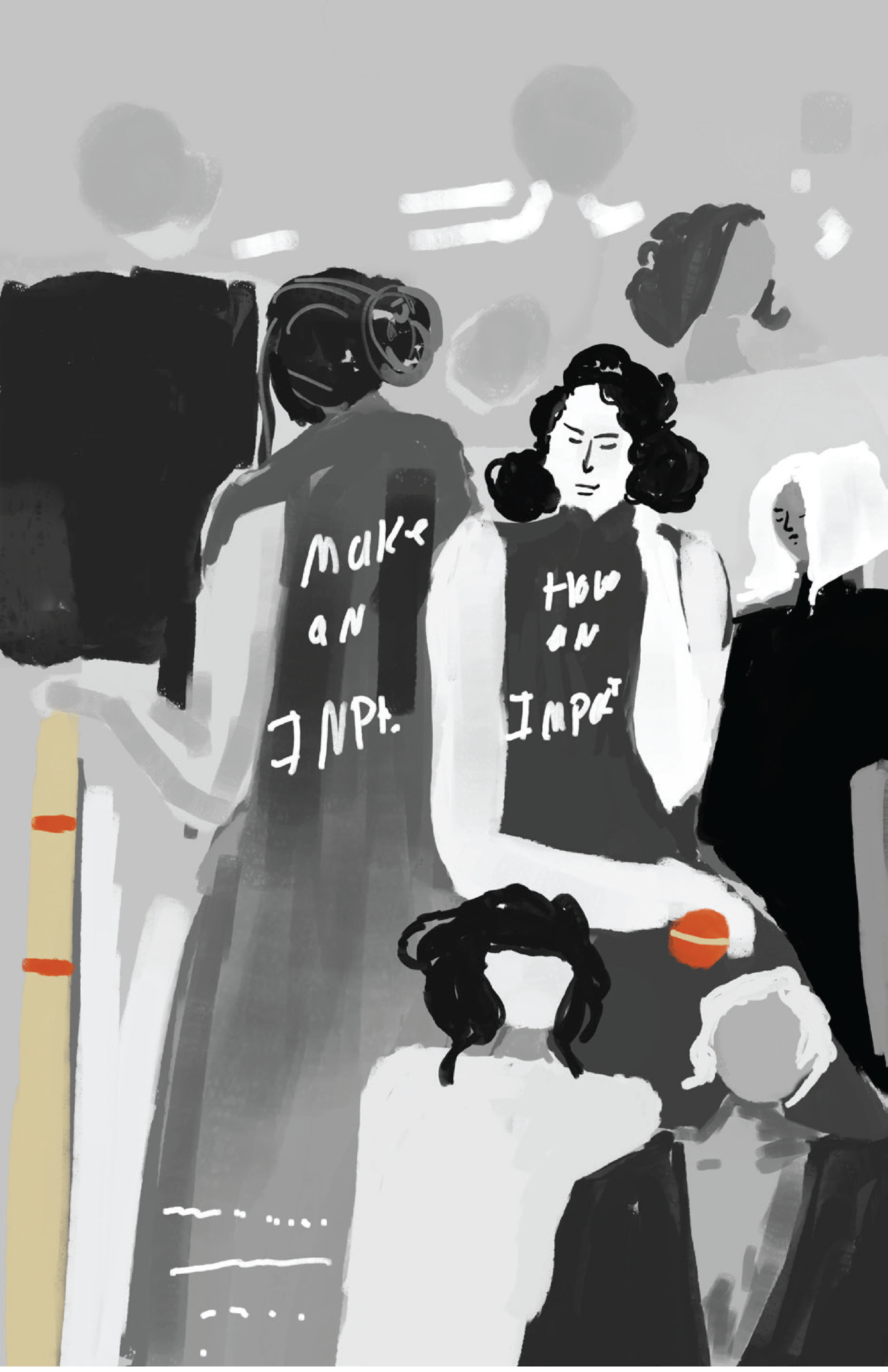
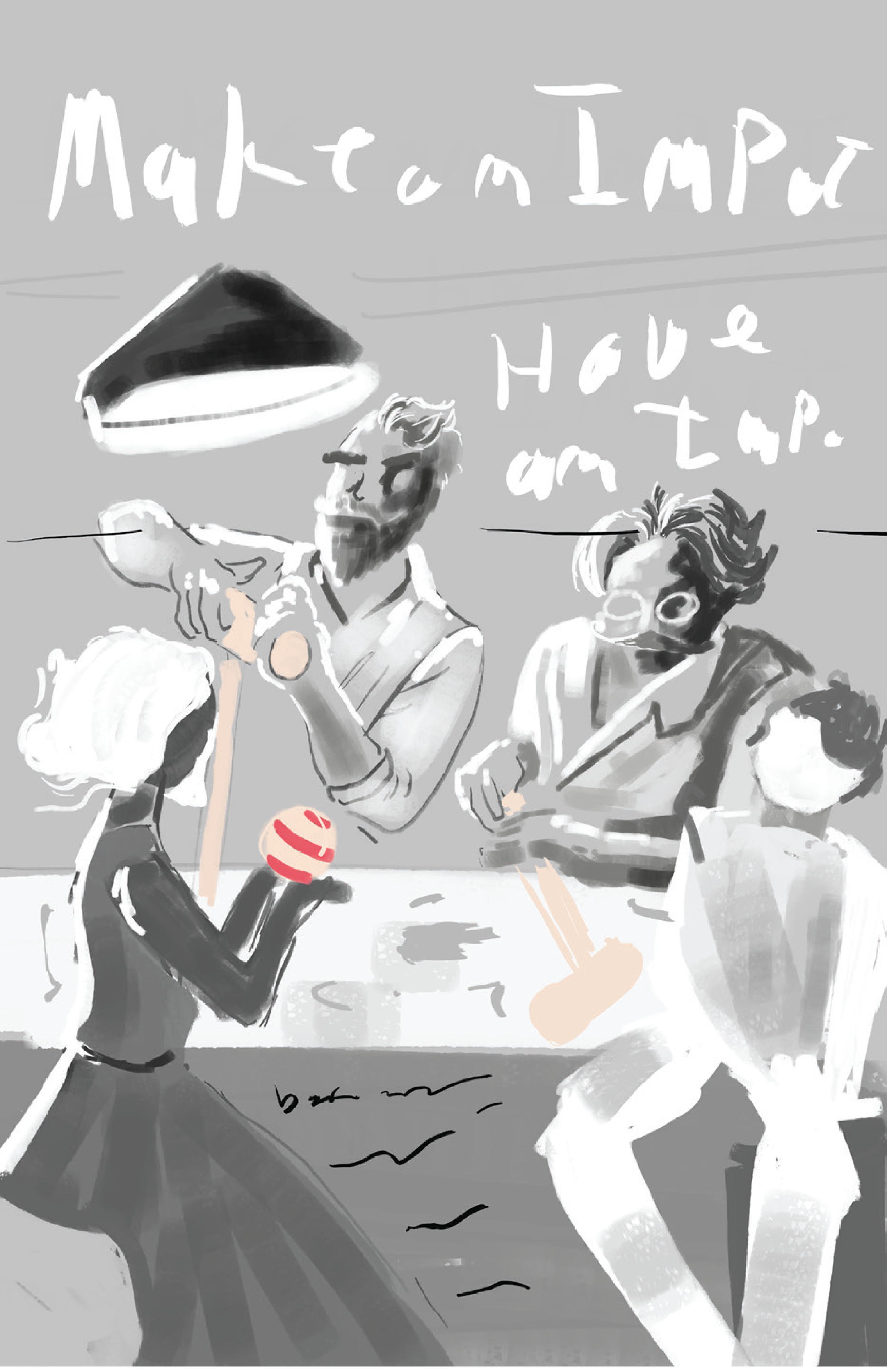
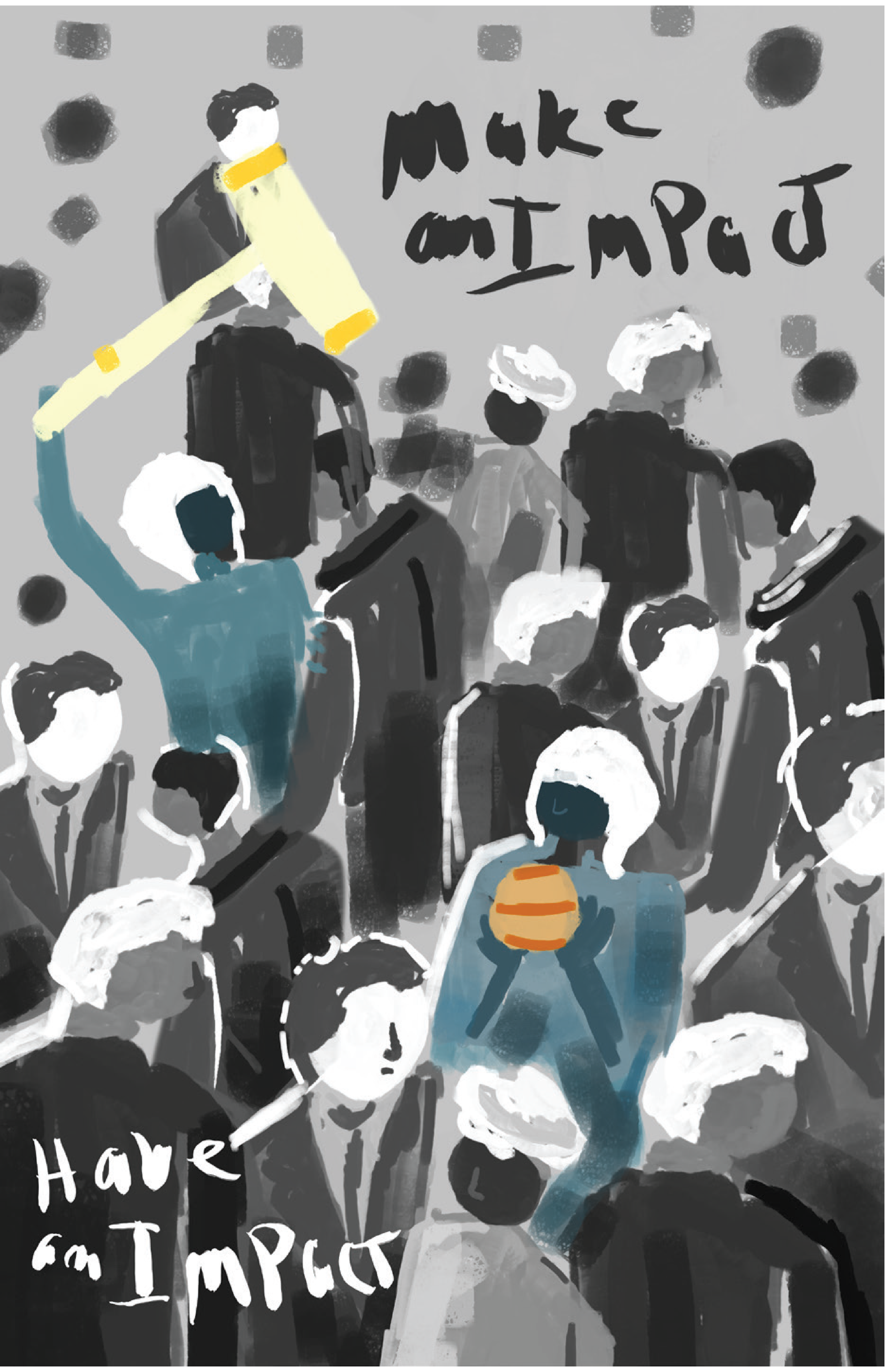
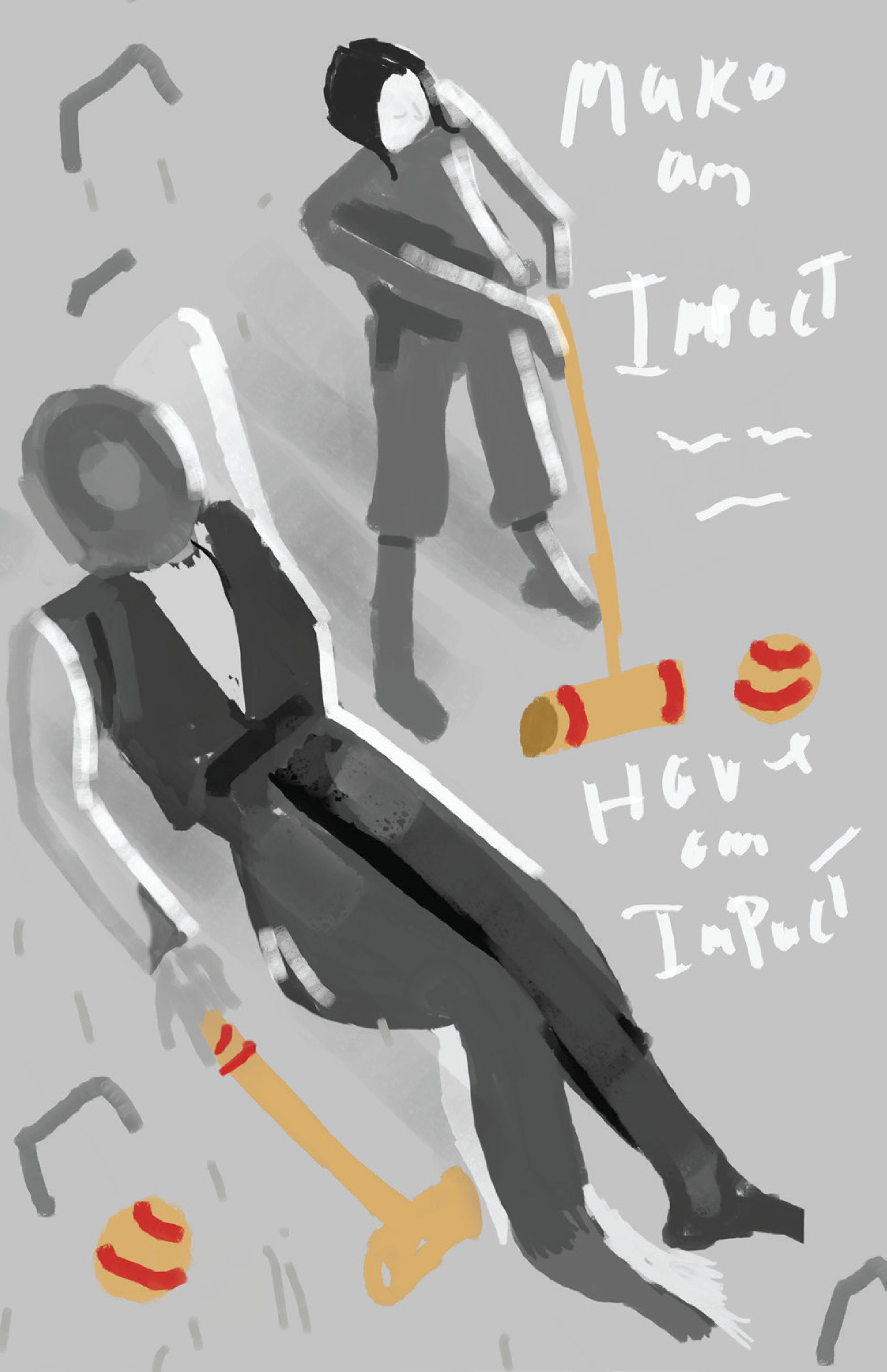
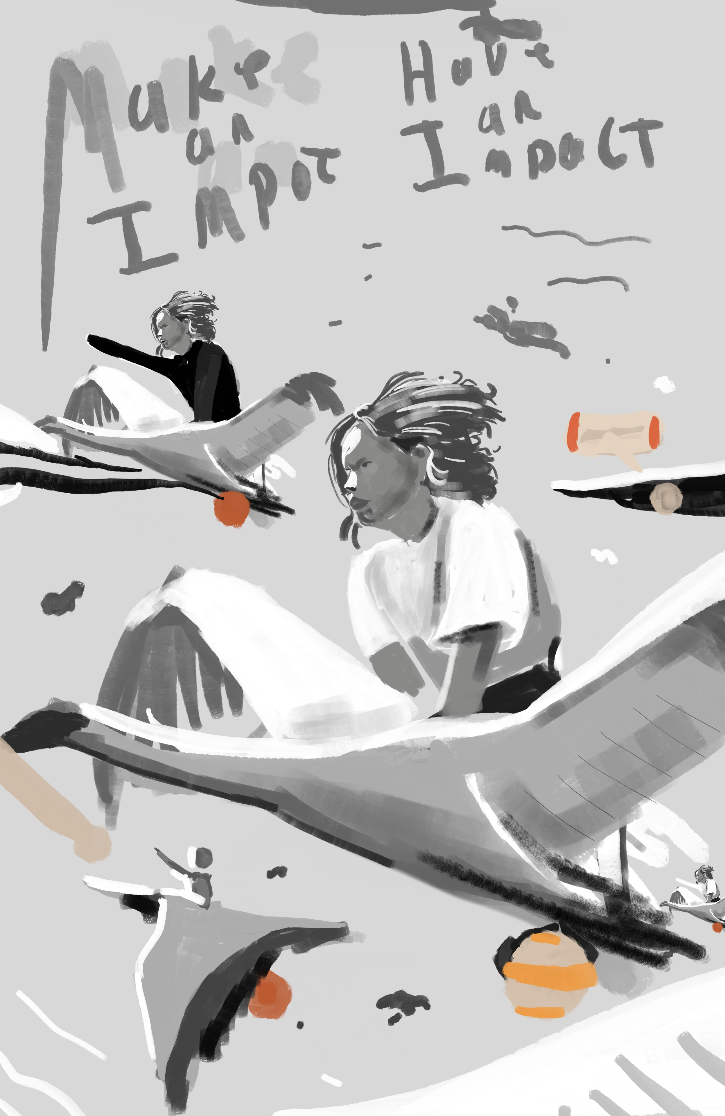
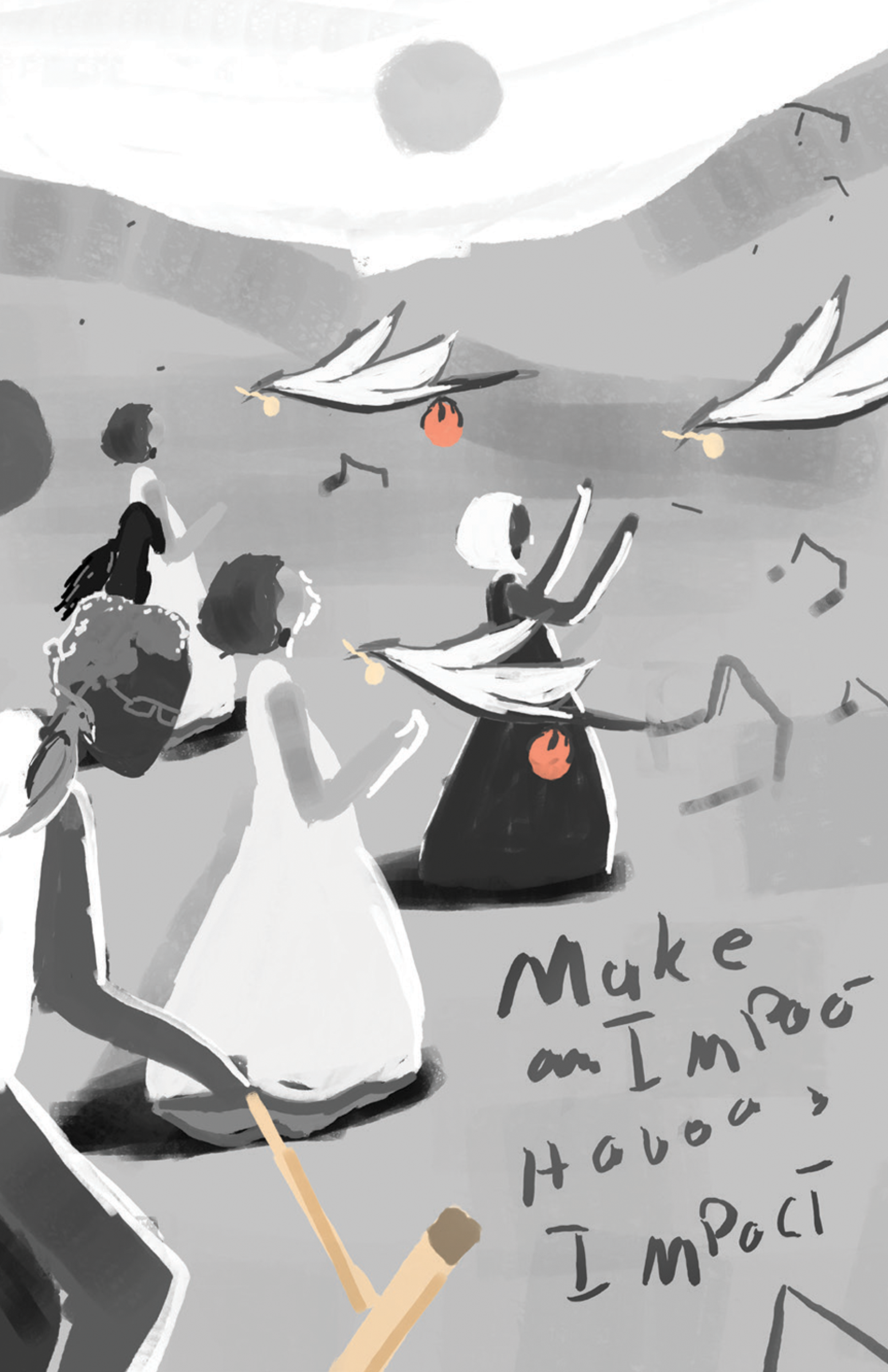
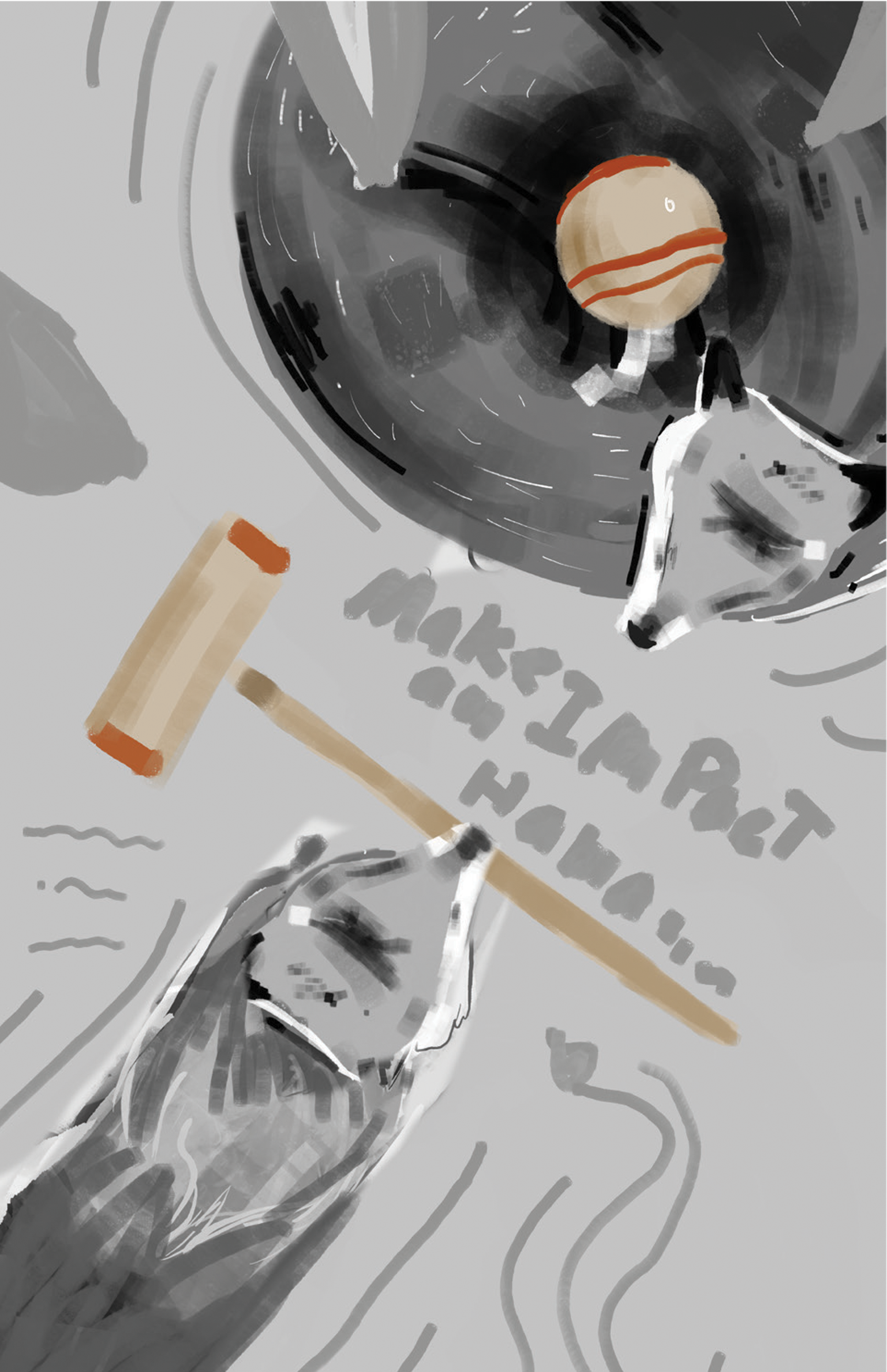
TIGHT SKETCHES
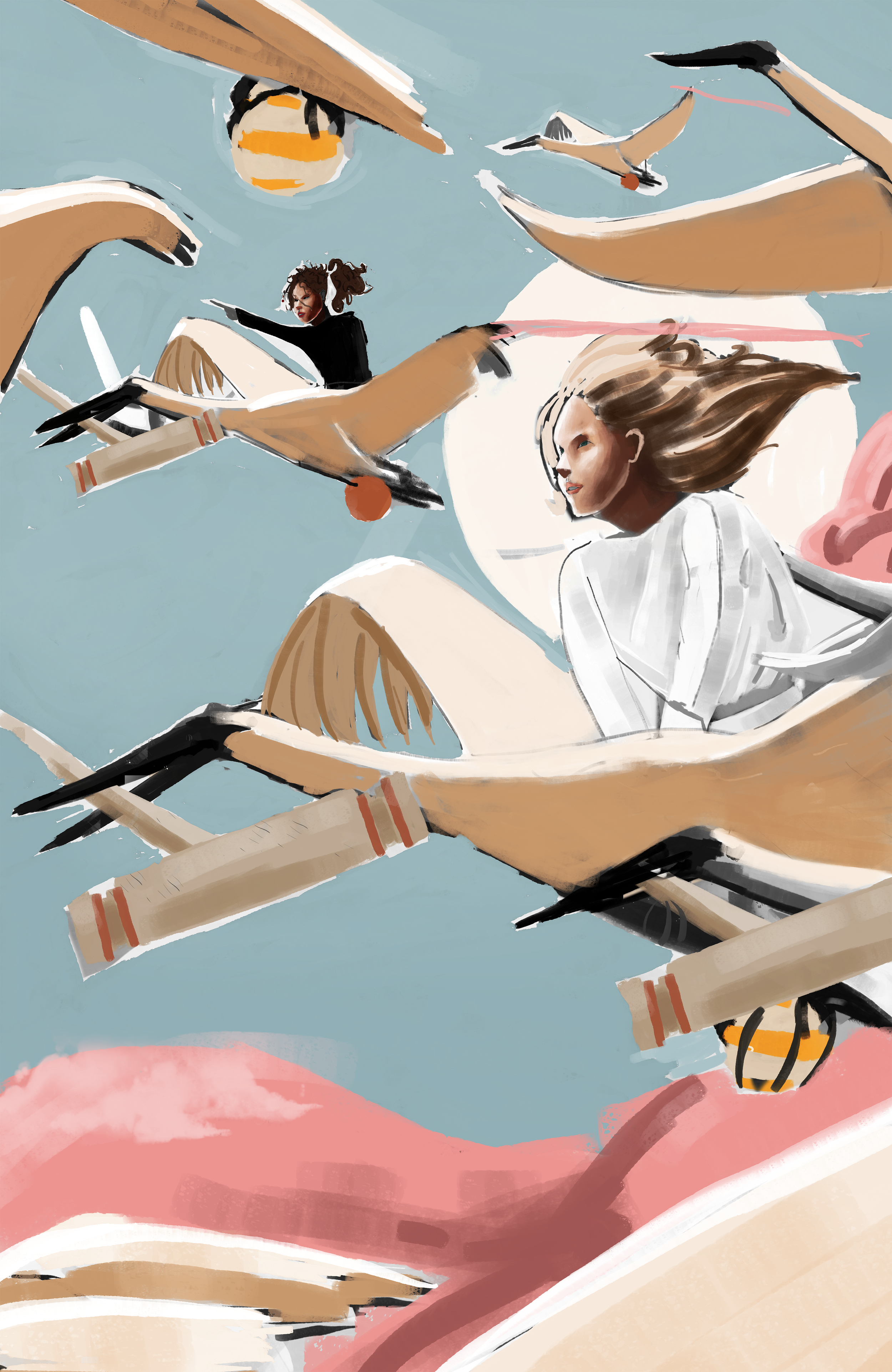
After reviewing the sketches with colleagues, I decided to move forward with sketches 6 and 8, as they most closely followed the parameters set at the start of the project. At this stage I named the pieces “Soar” and “A Croquet Union”, respectively. Ck requested two type layout solutions per poster.
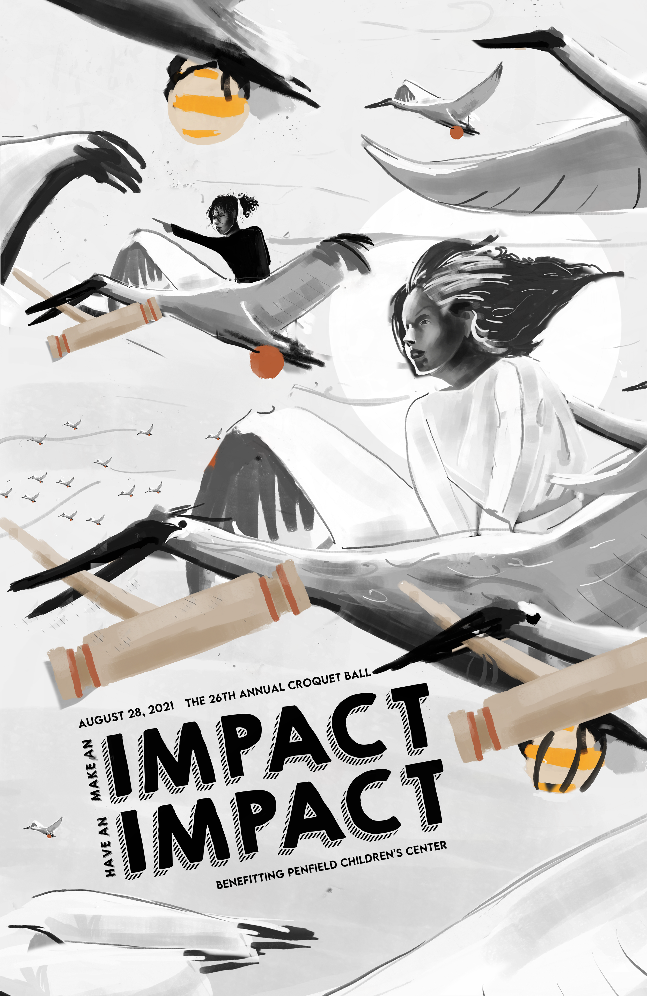
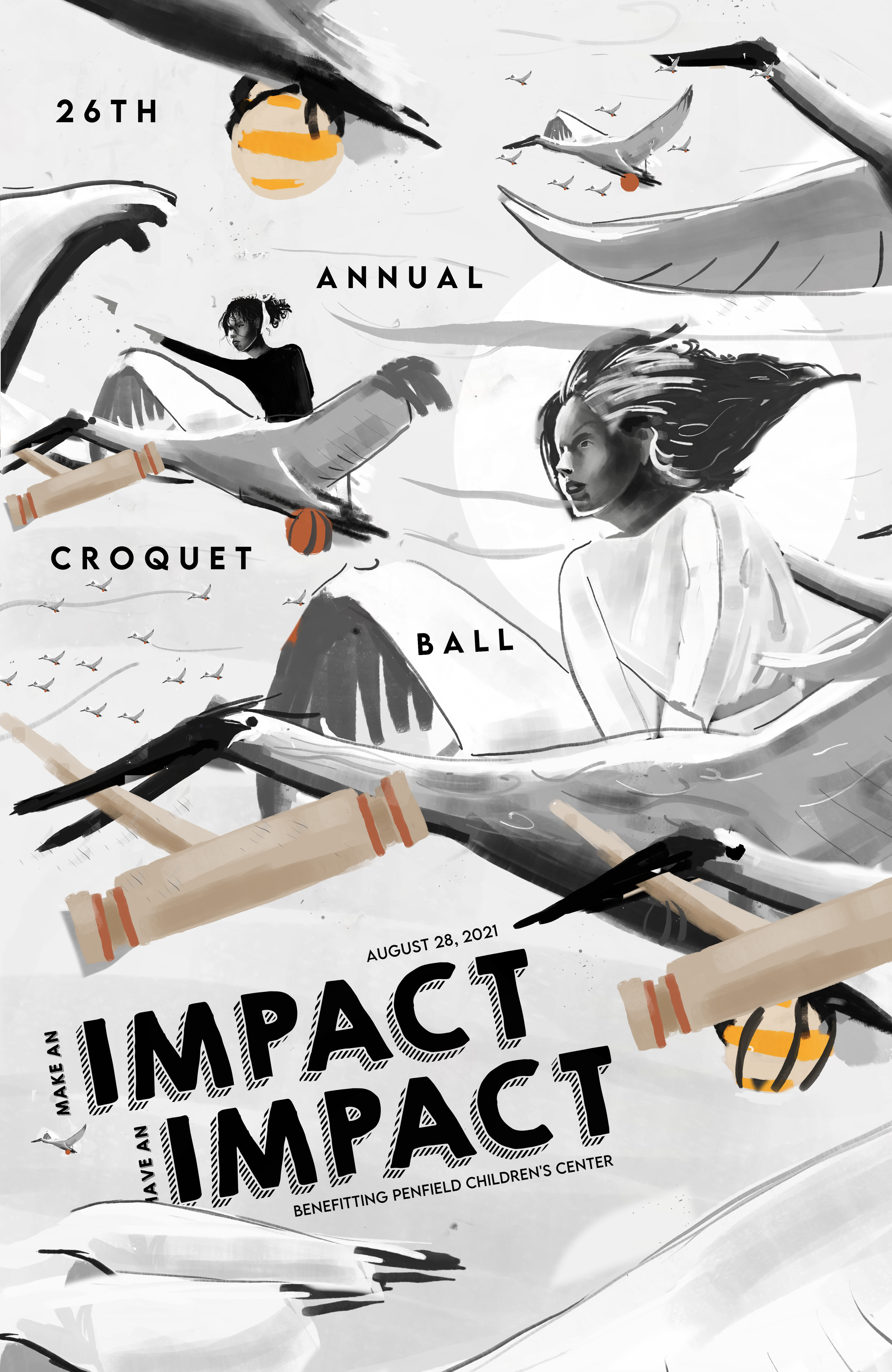
“Soar” illustrated how, with help from the croquet ball, the children at Penfield Children’s Center would have the support they needed to live full lives reach for the sky with their dreams and aspirations.
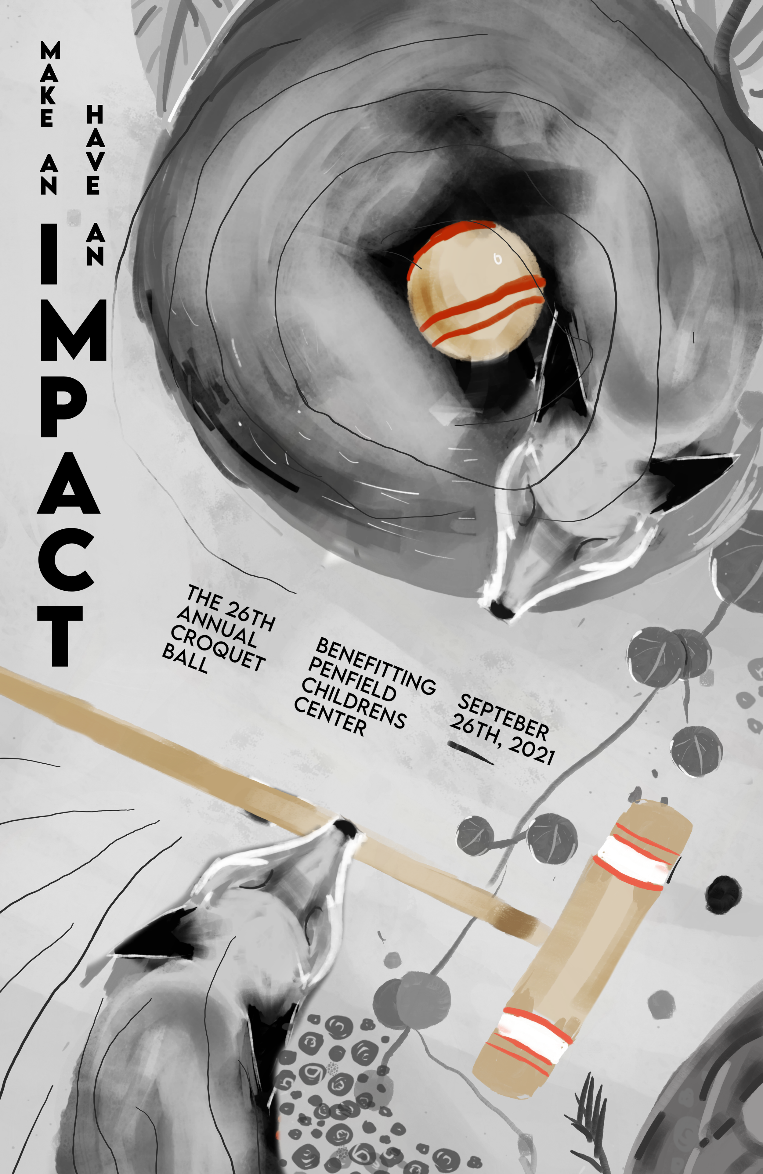
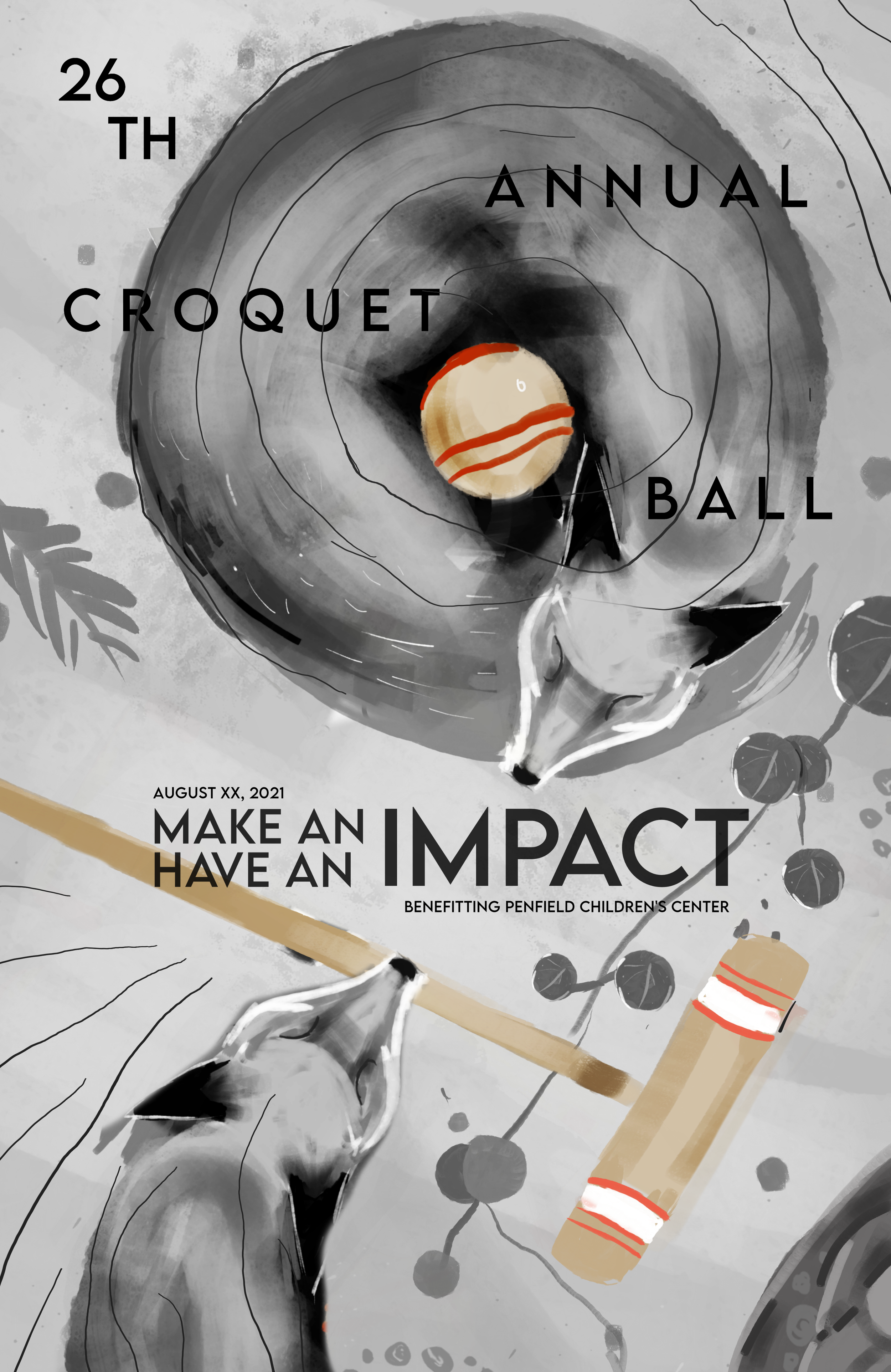
“A Croquet Reunion” illustrated how the assistance and generosity of others can make a big difference, as each fox carries a crucial piece of equipment to play croquet.
CK reviewed the tight sketches and requested to move forward with “Soar”.

PROCESS
At this stage, I was working on final art. I collected two pictures for color reference, the most impactful being an image of pink clouds at dusk, seen above. The image has a dream-like atmosphere, I knew I wanted to capture that effect in the final art. I received constant feedback as I worked, refining the piece over time. Another big factor I needed to address was the typography. I received the feedback that the typeface felt like brick sitting on top of the clouds. An altered type layout and lighter typeface was desired.
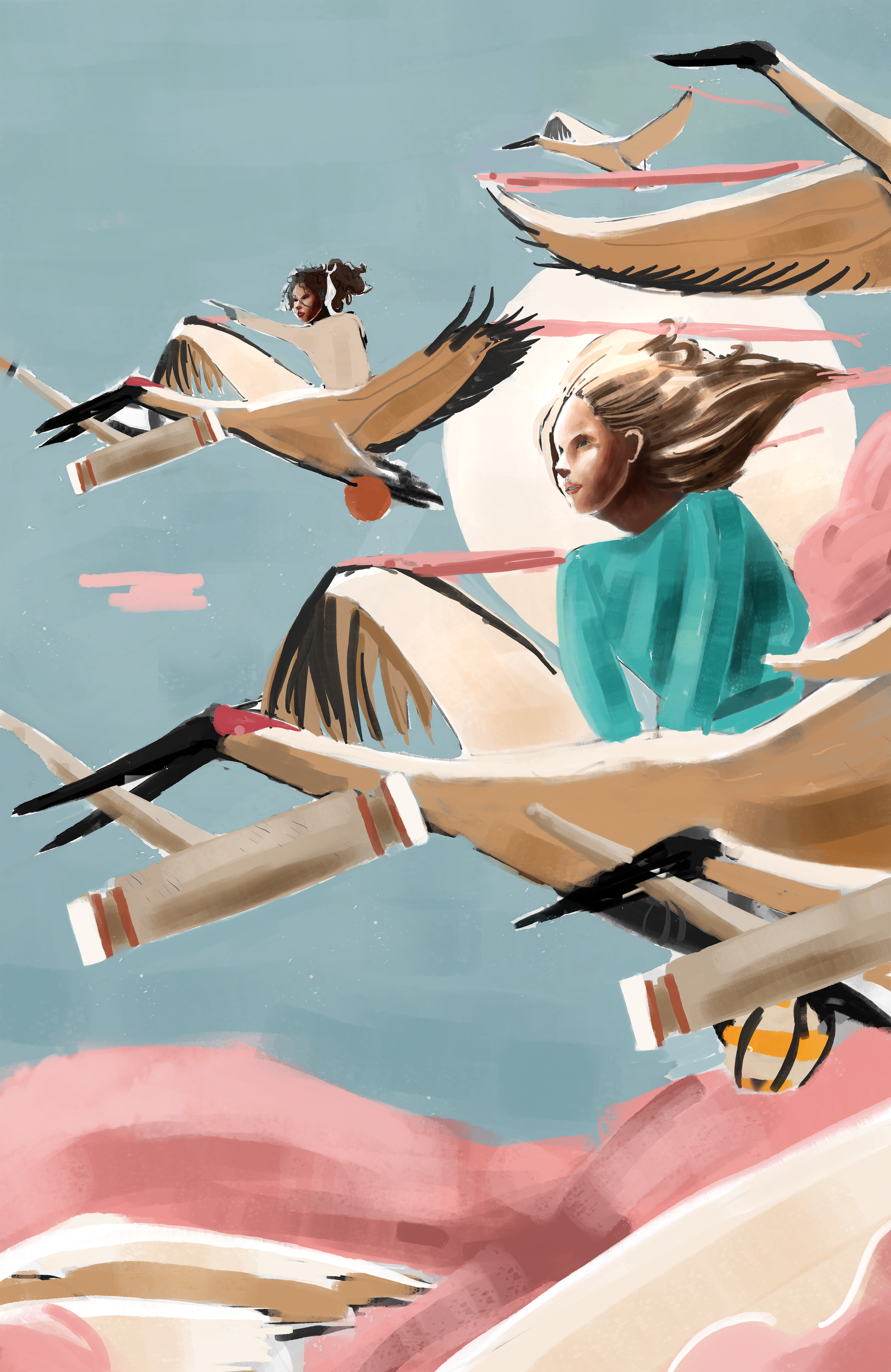


It was important for me to replace the type at this point. I knew I wanted something unique, so I began looking for non-uniform typefaces. I had little success with bubbly and handwritten typefaces. While whimsical, they weren’t as elegant as I was looking for, for the donors. I then found AODAI by One Pillar Studio, and immediately fell in love. I formatted the type to CK’s preference and continued refining the illustration.

FINAL ART
I received one more round of feedback at this stage, and made final adjustments. This piece was a joy to work on, and I am grateful to CK and Penfield for giving myself and the other artist this opportunity.


AWARDS
This piece received the first place award from Penfield Children’s Center, and received a Best in Show award from the United Ad Agency. I am grateful to have been given the opportunity to apply my skills for a good cause.

SOAR, Ky Middlebrooks, Digital Media